I’m a better photographer than this.
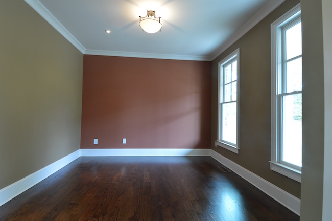
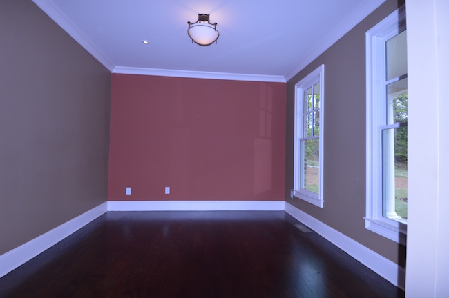
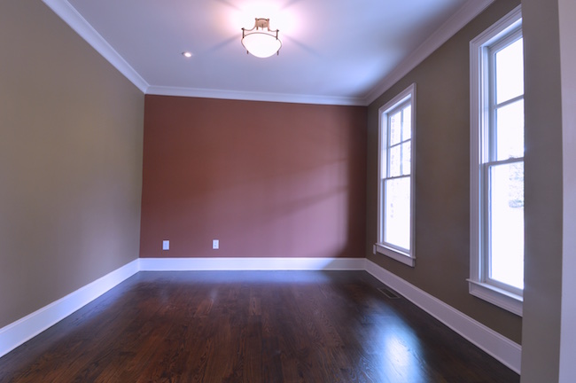
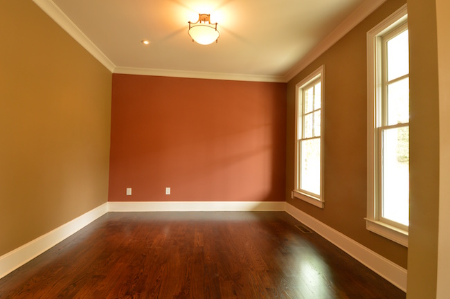
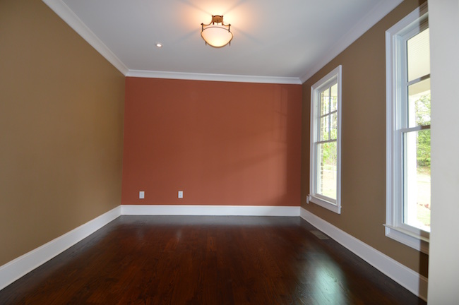
That’s my first and lasting thought as I take pictures of the interior of my house. The colors are horrible. My light browns are green. My terracotta is Santa Claus red. My dark walnut stain looks like red mahogany. My wasabi green island is mint green. Then I shoot it again and it’s grass green. Our colors are all aesthetically pleasing. These photos are not. I give up.
Next morning, I pull out my Bryan Peterson books. I check my camera settings. I drop the pictures on the laptop. Yep, they’re ungood and I need to figure out why. A little poking around with my fellow Nikonians and flipping through my photography books I come to the conclusion that interior real estate photography is the most deceptively difficult type of photography from an article I read entitled Interior Real Estate Photography Is The Most Deceptively Difficult Type of Photography. Here’s where it goes wrong.
Even on a nice cloudy day with perfectly diffuse and even lighting, I’m competing with at least 3 sources of light. I’ve got the sunlight coming in the windows, I’ve got any incandescent lighting in the room, and I’ve got all the residual light bouncing off the walls coloring the rest of the room. Then, I’ve got shadows to deal with and depth of lighting that might make the color look great on one wall and too deep on another. But the biggest problem is the shot itself. The room is the object. If I’m taking a picture of my son popping a bubble, and the shot is just a little bit green or a little bit red, it’s not even noticeable. But if the focus of the shot is the colors on the walls and on the floor, a blueshift will make you want to just give up.
So, I messed with it for another whole morning. Reshot the entire house. I adjusted my white balance, I read the lighting, readjusted my shots. They looked great on camera. Got them on my Mac and they were all bleh and dull. Turns out that my camera LCD screen isn’t as calibrated as I would like it to be.
Then I messed with it for another whole morning. Reshot the entire house. I adjusted my white balance, I read the lighting, readjusted my shots. They looked awful on camera, but I knew that I set the white balance “correctly” and they should look pretty great once I got them up on my Mac. They looked better, still not great. I tweaked them just a little bit and I thought the colors looked pretty spot on. I got excited. I was ready to post! I sent them to my friend Mike.
Interesting that you see green in the unedited photos, though—looks more yellow/gold to me.
Fiddle sticks.
Have you viewed the same photos on your iPhone for comparison?
Of course not. So, I sent them to my iPhone. Hmm. The edited ones look more yellow/gold and the originals looked pretty decent in retrospect. Why? Because I calibrated my monitor for print with a $100 color calibrator. Calibrate your monitor, the universe gets out of sync. It’s infuriating. Then I dove into a rabbit hole of monitor calibration and got half way through an article on the problems that arise from calibrating a small gamut monitor. What’s a gamut? Back to Apple’s stock calibration.
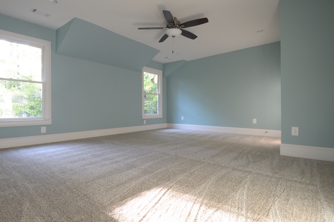
Here’s my favorite shot:
But all of that hair pulling and hand ringing and soul searching that arose from my very sub-par photos lead to the world’s greatest solution.
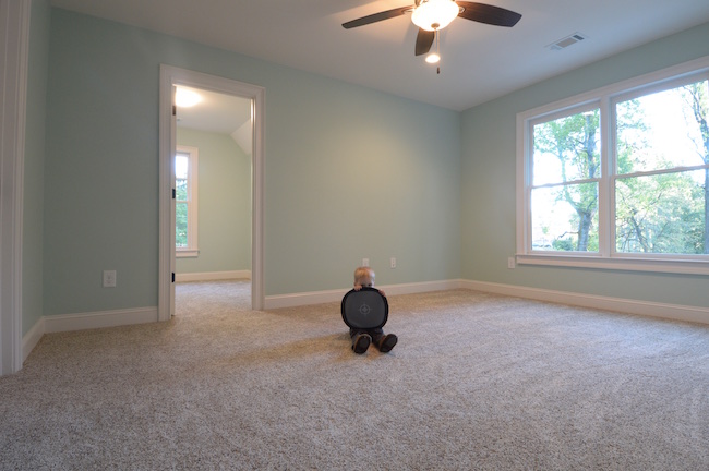
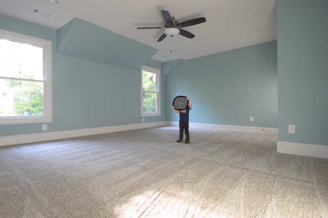
All you really need to do is get your 2 year old to hold a $9 grey card for the shot, then re-take the shot without him in it. Correct your photo to the grey card, then apply the fix to the “clean” photo. It takes about 15 seconds per shot and Daddy has a Big Helper!
So now my Big Helper is going to help me shoot the downstairs. Again.
Nothing’s easy. But a lot of it is fun.
Josh